Showcase your brand's unique look & feel
Axios HQ's suite of branding and customization features offers you more control and creative flexibility over the communications you send. Below, we break down each feature and how they work.
Features marked with a ⭐ require an upgrade from the Essential Package.
Table of contents:
- Logos and banners
- ⭐ Branded colors
- ⭐ Buttons
- ⭐ Image layouts
- ⭐ Card-level banners
- ⭐ Font sizes
- ⭐ Custom font
- ⭐ Custom footer
1. Logos and Banners
Add your company's logo or banner to your intro card via Series settings or at the Edition level.
Adding a logo or banner via Series settings:
🛠️ How it works:
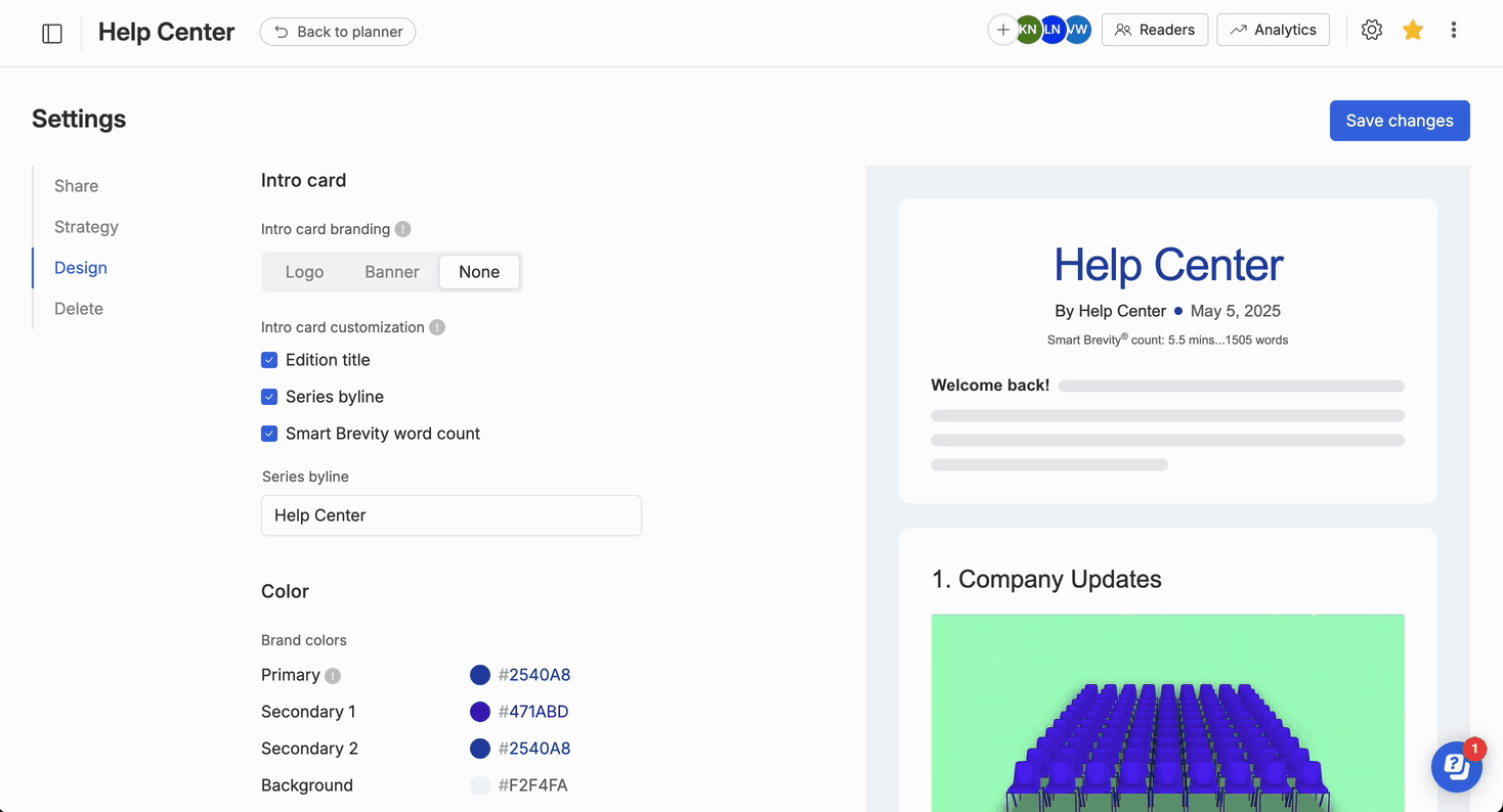
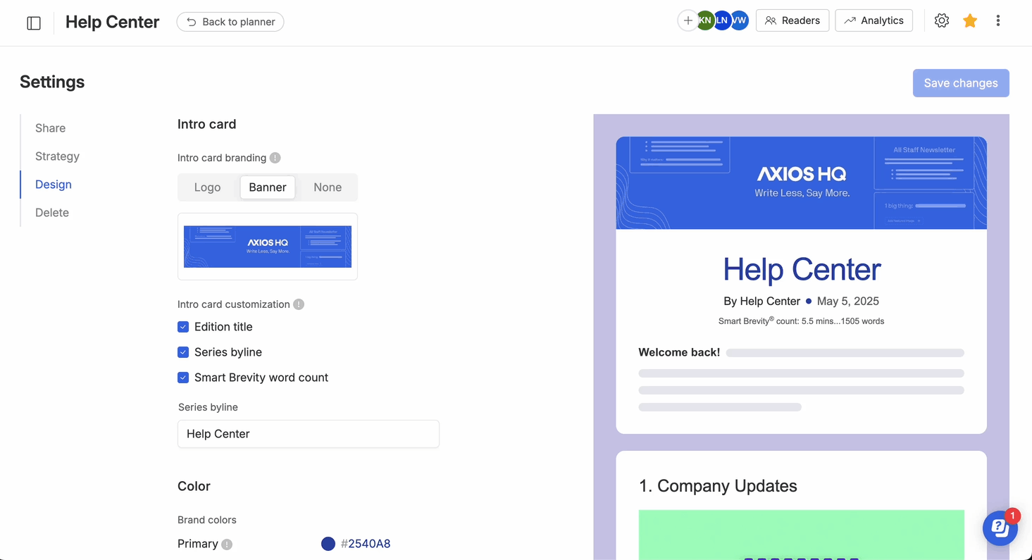
- Navigate to Series settings by clicking on the gear icon in the top right corner, then click the Design page.
- Select either a logo or banner.
-
Upload your image. Use the image cropping tool to size your banner or logo to the optimal image specs. You can review the Optimal Image Specs here.
- 💡 Use the preview pane to see how your banner or logo will look.
- 💡 Banners support animated gifs as long as they have the correct 4:1 ratio.
- Make sure to Save changes.
Adding a logo or banner at the Edition level:
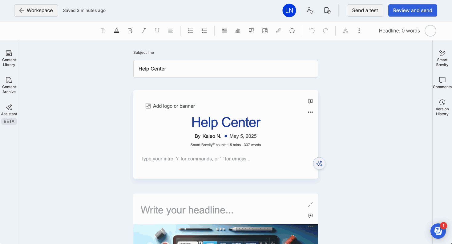
🛠️ How it works:
- In the intro card, click on the existing logo or banner to delete or update.
-
If no logo or banner exists, click "Add logo or banner" to upload one.
- 💡 Banners support animated gifs as long as they have the correct 4:1 ratio.
- To change an existing logo/banner, click on the image and then click the pencil icon to edit.
- Changes made in the editor will only affect that edition. It will not impact Series settings.
- View our article here to find optimal image specs for logos and banners.
2. ⭐ Branded Colors
To customize the colors of your series, you can select one primary color, two secondary colors, and a background color.
🛠️ How it works:
- Navigate to the Series settings page by clicking on the gear icon in the top right corner, then click the Design page.
- Click on the color you want to change and enter the hex color code or choose from the pre-selected color options.
- Select "Save changes" then navigate to the editor to use your series colors.
-
In the editor, you can apply colors to your text by navigating to the A icon in the toolbar and selecting from your color options.
3. ⭐ Buttons
Utilize the buttons feature to direct your audience to links outside of the edition. Use the buttons feature to link your readers to external content.
🛠️ How it works:
- In the editor, click on the "Add custom button" icon in the toolbar.
- A window will pop up, asking you to provide a title for your button and the link it should direct to.
- You can select the color of your button from your primary and secondary colors.
- Button text will adopt the body card font.
4. ⭐ Image Layouts
You can create an image collage and use it as the featured image or include it within the text of a card. You have two image collage options to choose from: side by side or a 2x2 grid.
🛠️ How it works:
- To use a collage as a feature image, click "Add image collage" at the top of your card and select your preferred option. Then, upload photos directly from your computer files.
- To insert an image collage within your text, click the image icon in the editor's toolbar and choose the collage option.
Image dimensions:
- For the side by side collage, aim for image dimensions of 296 x 296 px or a 1:1 width-to-height ratio.
- For the 2x2 grid, go for 298 x 170 px or a 7:4 width-to-height ratio.
💡 If you want to keep the collage for future use, don't forget to check the "Save collage to uploads" box.
5. ⭐ Card-level banners
You can use a banner or an image for a card headline.
🛠️ How it works:
- Add a feature image how you normally would, by selecting an image or collage at the top portion of your card.
- Select the 3 dots on the top right of the card and click "Remove headline."
- The feature image will now replace the headline and render as a banner at the top of that card.
6. ⭐ Font size
There are three different font size options to create hierarchy in your card. Font sizes are fixed and cannot be customized.
- Body — 12pt
- Subheader — 24pt
- Header — 33pt
🛠️ How it works:
- Navigate to the toolbar, select the "Tt" icon, and select the size that's the best fit.
7. ⭐ Custom fonts
You can also use a custom or brand font in the header and body of your series. This font will display for all recipients who have the font installed on their device.
- Please note: If the custom font is not downloaded on the recipient's device, a default font will be used.
🛠️ How it works:
- Use this form to request your custom font. If you have any questions, reach out to help@axioshq.com.
- Once your font is added, you will receive an email notification. To view font, navigate to the editor and start typing in a card.
- If you are not seeing the font come through, you may need to download the font on your device and add it to your font book.
- Custom body fonts will also appear in polls and buttons.
- 💡 You will not see your custom font name in your Series settings. It should automatically appear in the editor.
8. ⭐ Custom footers
You can add a custom footer, including text and links to social media.
🛠️ How it works:
- Navigate to Series settings by clicking on the gear icon in the top right corner, then click the Design page and scroll down.
- Select the social media icons that you would like to appear and insert the links for each. If you do not want to include icons, proceed to the next step.
- Insert the text you would like in your footer. You can bold, italicize, and hyperlink any text. Hit "Enter" on your keyboard to create space between lines of text.
- Use the Live preview section to test your links and preview exactly how it will look in your email.
- Send a test to yourself to confirm and see your footer in action.
Footer FAQs
Can you move the location of the social media icons?
Not at this time. If this is something you would like to see, leave your feedback here.
Can we have text displayed above the social media icons?
Not at this time. If this is something you would like to see, leave your feedback here.
Can we change the footer font?
Not at this time. If this is something you would like to see, leave your feedback here.
The icon that I want is not listed, can you add it?
The icons are hardcoded. Email help@axioshq.com and we'll see if there is anything we can do.